I have broken the links to hundreds and hundreds of photos, which will take a long time to repair. The workaround is to replace "photo.matthewpiers" in the link URL with "matthewpiers.smugmug". Awkward, but only temporary.
This is happening because I have revamped
matthewpiers dot com. More of what I write and photograph will be going there, so check it out as well.

3 comments:
A very different shot compared to the rest of your work. I like the balanced composition and the colors look great, as can be expected from your Olympus.
(See also my late comment on 'Tension')
Don't you just love the word verification feature?
Not only is comment-SPAM defeated for now, but it's like a fun little puzzle to solve and I get it right every time!
I'm always scared that I'll get the secret word wrong... I don't know what will happen if I do, but it's exciting.
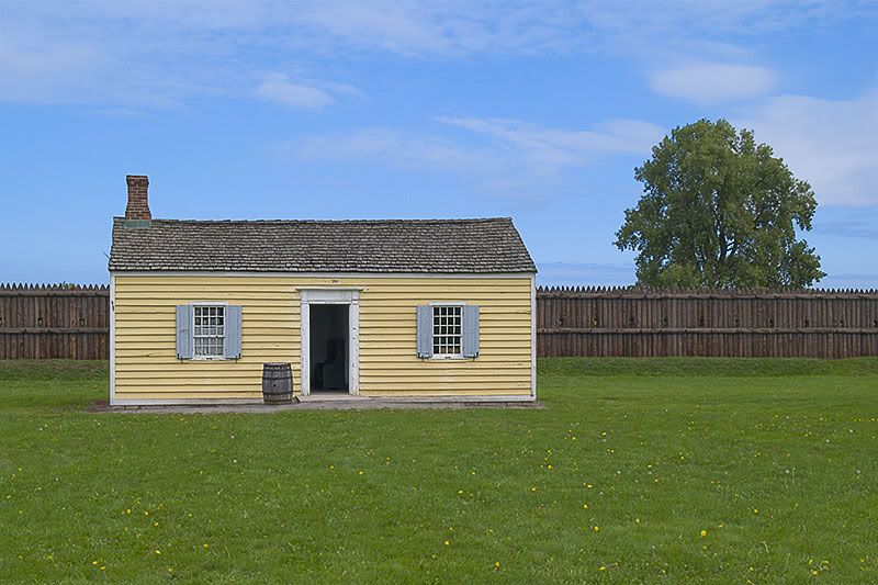
Fortunately I was with two experienced photographers last Saturday. I may not have noticed this scene if I was on my own. I'm not used to seeing geometric simplicity at a distance.
This really is a small cottage. The doorway is only slightly more than 6' high; the other proportions are similarly reduced. The two photographers I was with have photos with different people standing in the doorway; for reasons I won't go into, I don't.
This was taken without a tripod but with a grid focusing screen. The lines are straight, the angles are right, and no PP perspective distortions have been used.
(The word this time was 'laelca'.)
Here's a tip I discovered (architecture challenge): For a composition like this where the square subject needs to be anywhere besides dead-center, I still take the photo from the perfectly centered location, and put it in the middle of the frame for perspective and "squareness" control, but back up and zoom-out just barely enough to give me space to crop one side off to effectively move the exposure's actual center to a third line.
Do it all the time.
Keep people out of doorways!
(fiqmugum)
Post a Comment